Tag Archives: documentation

Field project; “Gorillas in the roses” collaging.  

For this project in field we looked at different ways in which collage can be done, and the variety it can take form in from collections to doodles to cutting and pasting and even animation.  

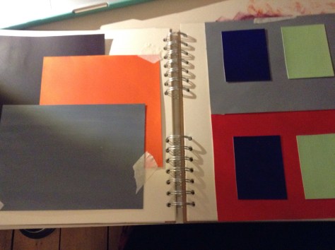
We created collages using old comic books and magazines and anything we could find that we could include into our work. I made some pieces using old boxes as well and manipulated them to become something with no obvious narrative; changing the original purpose of the box. 


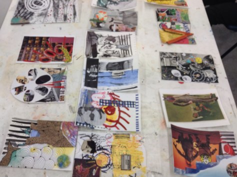
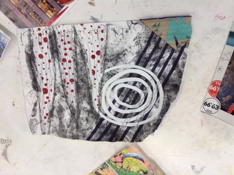
These are some of the collages we did as a group. We would each start off with an A5 piece of card and had to either draw paint or stick things down, and then we would pass it onto the next person to build up layers using different/ unique techniques to us. 

Edit


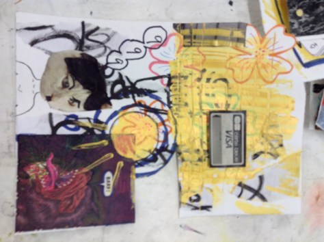
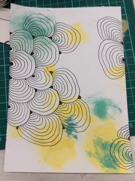
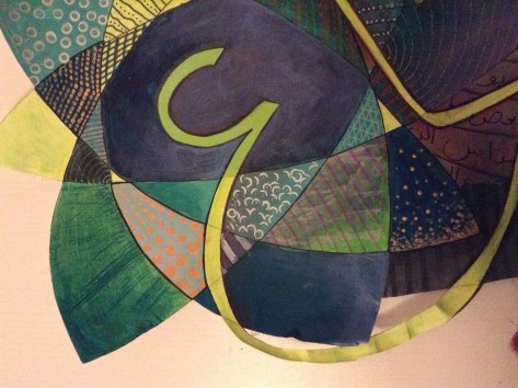
This was one of the layers I started for the group project using mixed media; acrylic paints and drawing on top with ink pen. 


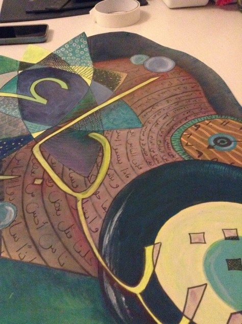
This is one piece I did on my own afterwards in the session which used a variety of techniques from sticking down card to build up layers and painting and drawing on top to add texture and depth. I thoroughly enjoyed creating this and found it sort of therapeutic and freeing. 

Cut out paintings: color theory related to subject and field work


This is the piece we did towards the end of the first field project, where we used the skills we learnt from the color theory workshops and layering techniques to create pieces (whatever theme we wanted; I related mine back to my subject area of work) in cut out shapes, not a usual rectangle shape composition. I really enjoyed this session and found it incredibly therapeutic to use color and random pattern in relation to the calligraphy to create a piece of artwork; none of which I had to think too hard about, as I focused on the aesthetics mainly. 


I used jiberish/random letters and words to fill in the spiral effect in the background but all words related to conflict and war however together none of which actually make sense in a sentence. The word in the calligraphy lettering in the front spells the word “bravery” in Arabic.

I then decided later on that this piece made me think of the thoughts and feelings and memories going through a refugees mind, the colors and textures and patterns; a mish mash of these emotions and uncertain futures. 


Stencil and calligraphy experiments


The original stencil I made which says “the future” in Arabic. I used it in numerous ways to experiment with colors and textures to use on paintings and collages later on. Some were spray painted, sponged over using acrylic paints or both on numerous papers and backgrounds to create different layered effects for a subtle message impact. The last photo used a modeling paste and spray paint to create a 3D effect to look like the words are standing out of the page. 


I have been experimenting with the color combinations as well as textures and overlaps to create different effects  creating the feelings of chaos and to symbolize the feelings related to the chaos. 


Color Theory; linked to subject work 


These photos are of the work we have been doing in correspondence with the color theory workshops we’ve been attending and my personal responses to them. They have been so helpful and given me a much more broad insight on how colors compliment and contrast one another and how to achieve certain shades/colors when I paint. 


These were “tests” we created which were linked to optical illusions inspired by artists such as Johannesburg Itten and Joseph Albers. The colors look different when next to each other and depending on things such as background color, can look completely different (even if they are the exact same shade). 


Some of the color match swatches we did using fruit and magazine clippings as inspiration. This was so interesting and much harder to do than I expected. 


Some of the tests we did to show that the same shade of a color can look completely different on different colored backgrounds. 


These photos are of experiments I did on my own after our workshops looking at how a color can create different impacts in relation to texture and background color. I’ve decided to use these techniques in my subject work to better my pieces and to really experiment with color contrasts and the way they can I handle or intensify a certain feeling in a piece (eg. anger and feeling scared are represented not just by red but also use purple and blue to darken the colors and the mood). I also really love the jagged texture of squares I painted using complimentary colors orange and purple here as a technique to possible enhance/ point out specifics in an article in the future possibly.