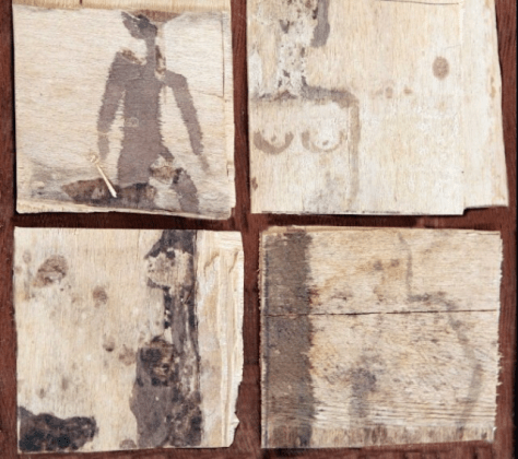
 I have been experimenting with different textures, colours and materials (such as hot glue, acrylic paint, ink pen and spray paints) to create brightly coloured smaller pieces from found pieces of randomly shaped wood. I have kept the original cuts, carvings and dents in the pieces and worked around the ‘flaws’ to beautify them. Each piece has a message written in Arabic related to refugees or the idea of pain and chaos.
 This one for example says “Quwwah” in Arabic, which means strength, which I wrote using a glue gun and hot glue to give it a 3D effect when I spray painted over it. I am so pleased with the way these pieces turned out. All of them simple and small with big bold colours and meanings.
 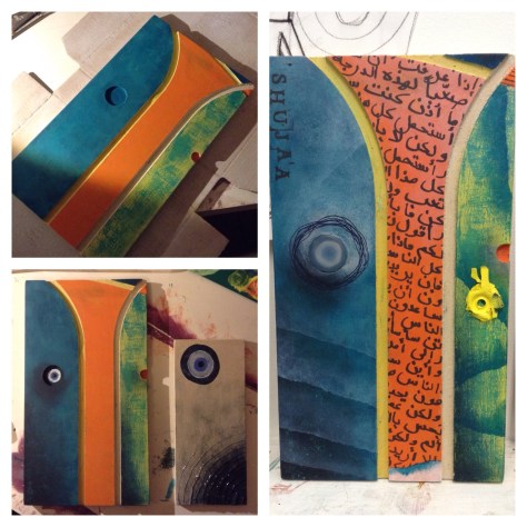 “Shuja’a” means strength in arabic. I like the idea of using English letters to write an Arabic words phonetics so that non-Arabic speakers can still read the message without instantly knowing what the piece is about.
  I plan on working on this crate using some symbols of good fortune/ good luck, to turn this item of ‘junk’ into somewhat of a lucky charm.
Category Archives: Subject Second Year
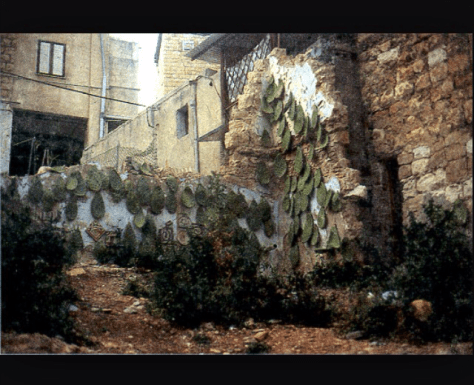
Artist research: Rana Bishara
Rana Bishara is a Lebanese born artist who work is mainly based around social and political issues linked to conflict.

The reason Bishara uses cacti a lot throughout her work is because it has become a symbol of the “Nakbe” which is the name of the time of conflict and tragedy in 1948 in Palestine. The reason for this is that the cacti is resilient with little resources, it can protect its self against danger and can survive even after being uprooted. It was also used as fences to keep enemies off unwanted territory. The cacti is a strong symbol for the Palestinian refugees.

Her use of calligraphy and typography in some of her work helps support the narrative but also gives the viewer better insight into the message being portrayed. Although the text is not easy to read (which is similar to my own work; as I use it to symbolize thoughts in someone’s head who is angry or struggling like a refugee) some words and phrases are legible and give the viewer an insight into her emotions and thoughts going through the artists mind at the time.

Her distinct work using Cacti and calligraphy often portrays a message that may not be u sera told straight away at first but when the knowledge of the subject is known; becomes perfectly clear. This is something I wish to add and incorporate into my work more by adding symbols and words that may not at first be understood; however with an explanation becomes clear.
I have been trying to find a way to make a subtle yet strong impact in my work however have found this difficult. Through the use of calligraphy, Arabic text and clipping from news articles I have tried to achieve this however found that it was sometimes unclear to those who don’t understand the language. I may start to add a caption or title for every piece, in English as to give the viewer a clearer idea of the narrative of the piece but to not give away too much and get the viewer thinking.
Artist statement:
I started off this project knowing briefly what ideas and concepts I wanted to work around, but no idea where to start. I decided to start off around the idea of the refugees suffering in the camps and the effects the trauma and chaos of war had on them.
The Zaatari refugee camp in the North of Jordan (Jordan being home for me) was the camp I decide to focus on. For my subject work I started looking at different ways I could portray emotions and the truths of the war and its effects, looking at artists like Herakut and Joel Bergner (aka JoeArtista) and the murals they created in camps and the great impact they made on Zaatari community. I decided to work similarly creating pieces that had an impact on a smaller scale with subtle messages; making others more aware of the pain and emotions related to being a refugee; specifically the children affected.
I have experimented with so many different mediums and techniques to try and best express these feelings from using collaging skills learnt in field and printing calligraphy/stenciling to painting using oils and using inks for writing traditional calligraphy. Although I was set back a bit due to illness and being on bed-rest, I am still motivated to continue to work on this project and to expand and explore the area further to create more work with good impacts and messages.
Cut out paintings
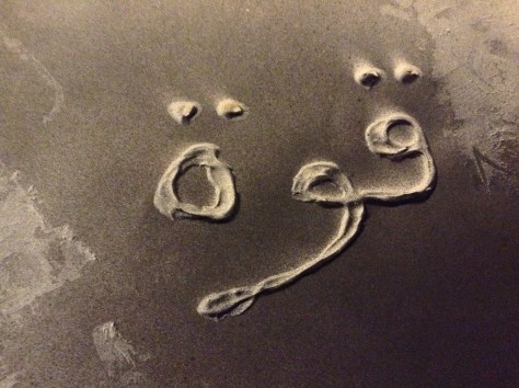
These are pictures of the progress so far for the cut out painting I designed for our new field module. I decided to link this to my subject area as well as I though it could move my work into a less serious place, but still subtly conveying a message. The piece is inspired by the tents in the refugee camps and the evil eye/all seeing eye (which is believed to be a lucky charm that looks out for you in the Muslim and most of the middle eastern area) is looking down on the tent and acting as a halo. A confusing piece with surrealist hints but I am excited to see where this piece goes.


Calligraphy practice:
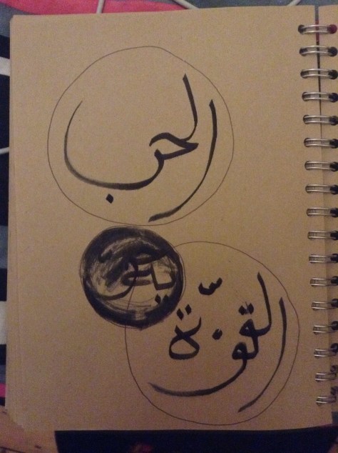
I recently purchased a few art supplies to get me back into the swing of things after being away for so long. I bought a bamboo drawing ‘pen’ which is used with inks to practice calligraphy. I have been playing around and practicing with it a lot to get the hang of it as it is not that easy.
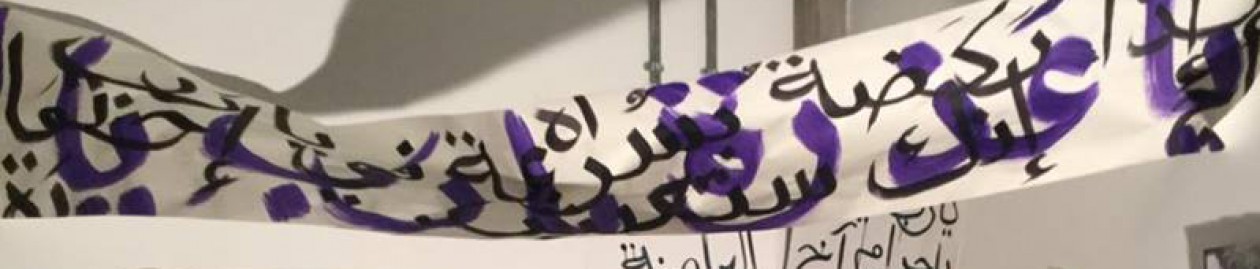
These are some random words and phrases however the calligraphy itself is some of the best I’ve managed to do in a while. The picture with the calligraphy in the bubbles is more thought through and are words saying war and strength. I am planning on using this more and more in my work now creating good angles in the calligraphy also an authentic Arabic feel to my work by using ink and old fashioned drawing utensils.

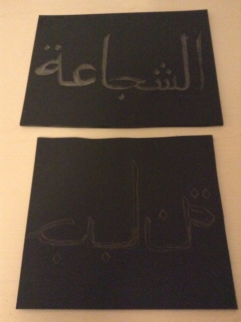
Lino cuts/prints – work in progress:

I used Lino to create cuts to print from. I decided to create two cuts that would be printed on top of one another, the words read “bravery” and the contradicting term “cowardliness” which will be printed on top of each other however will also mirror each other as one was carved backwards and will there for be printed mirrored.
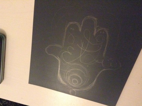
This last piece I am planning on carving the hand of Fatima symbol on with the words written in creative calligraphy “strength and bravery” as part of this bravery themed collection of print. All the pieces at linked to lucky objects and I plan on making more to go with this series as I am really enjoying getting back into things and into printing.
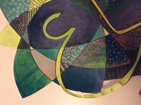
Cut out paintings: color theory related to subject and field work

This is the piece we did towards the end of the first field project, where we used the skills we learnt from the color theory workshops and layering techniques to create pieces (whatever theme we wanted; I related mine back to my subject area of work) in cut out shapes, not a usual rectangle shape composition. I really enjoyed this session and found it incredibly therapeutic to use color and random pattern in relation to the calligraphy to create a piece of artwork; none of which I had to think too hard about, as I focused on the aesthetics mainly.
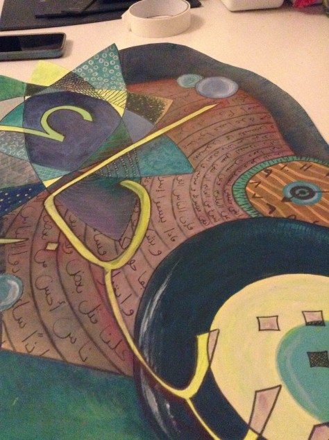

I used jiberish/random letters and words to fill in the spiral effect in the background but all words related to conflict and war however together none of which actually make sense in a sentence. The word in the calligraphy lettering in the front spells the word “bravery” in Arabic.
I then decided later on that this piece made me think of the thoughts and feelings and memories going through a refugees mind, the colors and textures and patterns; a mish mash of these emotions and uncertain futures.
Artist research: Tayseer Barakat
Tayseer Barakat is a Palestinian artist from Gaza born in 1959 and lived in the West Bank in the heart of the conflict and chaos. Most of Barakats work was done using found objects as resources in the village where he lived where extremely scarce and limited; such as old bits of wood and paper giving them a raw feel. His work mainly portrayed what he saw in his everyday life living in the villages and his emotional struggle with it.

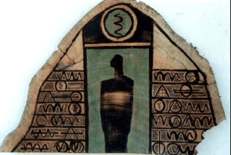

I want to create pieces on similar surfaces of objects I have found that can help support my work and build up an image on them using the texture of the ground.
Stencil and calligraphy experiments

The original stencil I made which says “the future” in Arabic. I used it in numerous ways to experiment with colors and textures to use on paintings and collages later on. Some were spray painted, sponged over using acrylic paints or both on numerous papers and backgrounds to create different layered effects for a subtle message impact. The last photo used a modeling paste and spray paint to create a 3D effect to look like the words are standing out of the page.

I have been experimenting with the color combinations as well as textures and overlaps to create different effects creating the feelings of chaos and to symbolize the feelings related to the chaos.


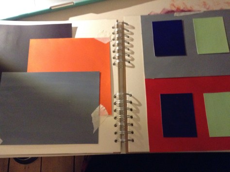
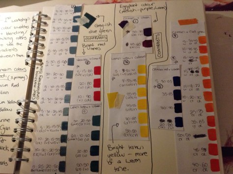
Color Theory; linked to subject work

These photos are of the work we have been doing in correspondence with the color theory workshops we’ve been attending and my personal responses to them. They have been so helpful and given me a much more broad insight on how colors compliment and contrast one another and how to achieve certain shades/colors when I paint.

These were “tests” we created which were linked to optical illusions inspired by artists such as Johannesburg Itten and Joseph Albers. The colors look different when next to each other and depending on things such as background color, can look completely different (even if they are the exact same shade).
Some of the color match swatches we did using fruit and magazine clippings as inspiration. This was so interesting and much harder to do than I expected.

Some of the tests we did to show that the same shade of a color can look completely different on different colored backgrounds.

These photos are of experiments I did on my own after our workshops looking at how a color can create different impacts in relation to texture and background color. I’ve decided to use these techniques in my subject work to better my pieces and to really experiment with color contrasts and the way they can I handle or intensify a certain feeling in a piece (eg. anger and feeling scared are represented not just by red but also use purple and blue to darken the colors and the mood). I also really love the jagged texture of squares I painted using complimentary colors orange and purple here as a technique to possible enhance/ point out specifics in an article in the future possibly.

