
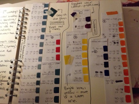
These photos are of the work we have been doing in correspondence with the color theory workshops we’ve been attending and my personal responses to them. They have been so helpful and given me a much more broad insight on how colors compliment and contrast one another and how to achieve certain shades/colors when I paint.

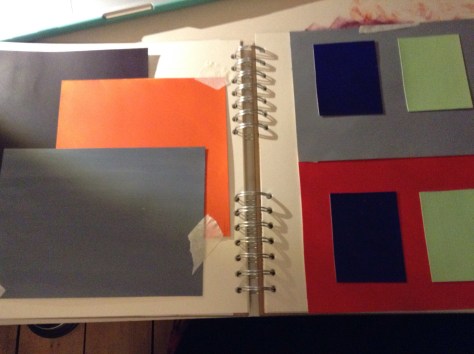
These were “tests” we created which were linked to optical illusions inspired by artists such as Johannesburg Itten and Joseph Albers. The colors look different when next to each other and depending on things such as background color, can look completely different (even if they are the exact same shade).
Some of the color match swatches we did using fruit and magazine clippings as inspiration. This was so interesting and much harder to do than I expected.

Some of the tests we did to show that the same shade of a color can look completely different on different colored backgrounds.

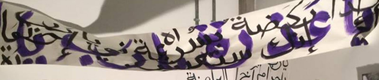
These photos are of experiments I did on my own after our workshops looking at how a color can create different impacts in relation to texture and background color. I’ve decided to use these techniques in my subject work to better my pieces and to really experiment with color contrasts and the way they can I handle or intensify a certain feeling in a piece (eg. anger and feeling scared are represented not just by red but also use purple and blue to darken the colors and the mood). I also really love the jagged texture of squares I painted using complimentary colors orange and purple here as a technique to possible enhance/ point out specifics in an article in the future possibly.

