Tag Archives: contextualisation

Artist research: Rana Bishara

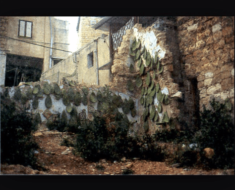
Rana Bishara is a Lebanese born artist who work is mainly based around social and political issues linked to conflict. 


The reason Bishara uses cacti a lot throughout her work is because it has become a symbol of the “Nakbe” which is the name of the time of conflict and tragedy in 1948 in Palestine. The reason for this is that the cacti is resilient with little resources, it can protect its self against danger and can survive even after being uprooted. It was also used as fences to keep enemies off unwanted territory. The cacti is a strong symbol for the Palestinian refugees. 


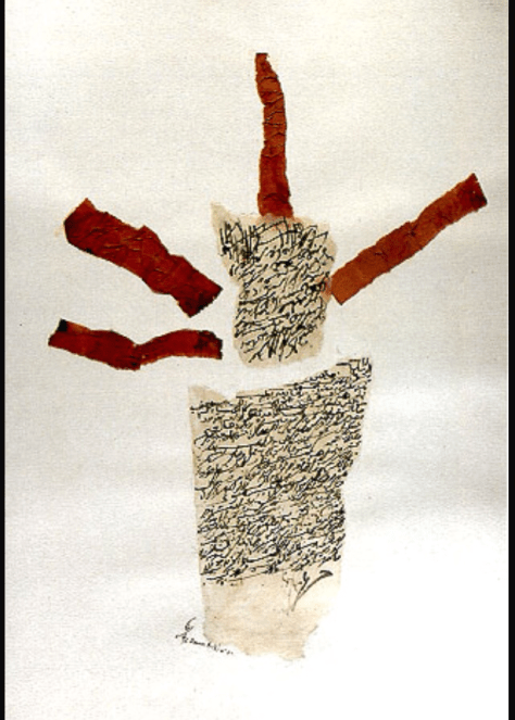
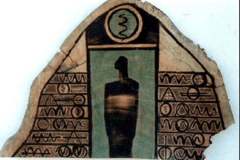
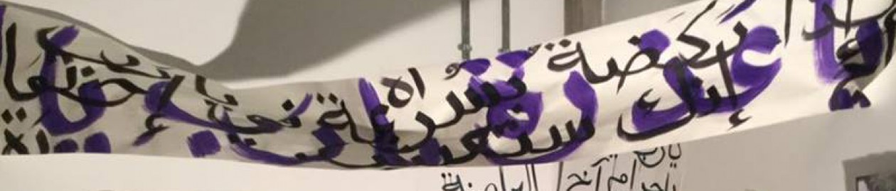
Her use of calligraphy and typography in some of her work helps support the narrative but also gives the viewer better insight into the message being portrayed. Although the text is not easy to read (which is similar to my own work; as I use it to symbolize thoughts in someone’s head who is angry or struggling like a refugee) some words and phrases are legible and give the viewer an insight into her emotions and thoughts going through the artists mind at the time. 


Her distinct work using Cacti and calligraphy often portrays a message that may not be u sera told straight away at first but when the knowledge of the subject is known; becomes perfectly clear. This is something I wish to add and incorporate into my work more by adding symbols and words that may not at first be understood; however with an explanation becomes clear. 

I have been trying to find a way to make a subtle yet strong impact in my work however have found this difficult. Through the use of calligraphy, Arabic text and clipping from news articles I have tried to achieve this however found that it was sometimes unclear to those who don’t understand the language. I may start to add a caption or title for every piece, in English as to give the viewer a clearer idea of the narrative of the piece but to not give away too much and get the viewer thinking. 

Advertisement

Artist research: Tayseer Barakat 

Tayseer Barakat is a Palestinian artist from Gaza born in 1959 and lived in the West Bank in the heart of the conflict and chaos. Most of Barakats work was done using found objects as resources in the village where he lived where extremely scarce and limited; such as old bits of wood and paper giving them a raw feel. His work mainly portrayed what he saw in his everyday life living in the villages and his emotional struggle with it.  


I want to create pieces on similar surfaces of objects I have found that can help support my work and build up an image on them using the texture of the ground. 

Color Theory; linked to subject work 


These photos are of the work we have been doing in correspondence with the color theory workshops we’ve been attending and my personal responses to them. They have been so helpful and given me a much more broad insight on how colors compliment and contrast one another and how to achieve certain shades/colors when I paint. 


These were “tests” we created which were linked to optical illusions inspired by artists such as Johannesburg Itten and Joseph Albers. The colors look different when next to each other and depending on things such as background color, can look completely different (even if they are the exact same shade). 


Some of the color match swatches we did using fruit and magazine clippings as inspiration. This was so interesting and much harder to do than I expected. 


Some of the tests we did to show that the same shade of a color can look completely different on different colored backgrounds. 


These photos are of experiments I did on my own after our workshops looking at how a color can create different impacts in relation to texture and background color. I’ve decided to use these techniques in my subject work to better my pieces and to really experiment with color contrasts and the way they can I handle or intensify a certain feeling in a piece (eg. anger and feeling scared are represented not just by red but also use purple and blue to darken the colors and the mood). I also really love the jagged texture of squares I painted using complimentary colors orange and purple here as a technique to possible enhance/ point out specifics in an article in the future possibly. 


Herakut: the artists behind the Zaatari art 


This is the original graffiti/painting mural piece that the duo known as “Herakut”, that I decided to use as a starting point for my subject area project. The piece is located in the Zaatari refugee camp in Jordan for the Syrians who take refuge there. It was done by the duo with the help of the children in the camp (a collaborative and involving piece). 

The artists use a unique style of mixed graffiti and emulsion paints combining detailed parts and rough texture to create the final pieces with vibrant and bold patterns and colors. 

The child seen in the painting is building the word “home” out of playing blocks; the child is rebuilding his home/life. This piece touched me the most from their series of work done in the Zaatari camp, and its sublet yet powerful message is the effect I want to make using my work in response to this. I want to create similar bold and colorful pieces of work with similar subtle messages conveying a powerful message.