Tag Archives: documentation

5) Documentation: Final ideas – planning tent 

*UPDATED 5th May*

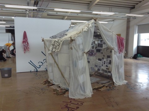
This is my final updated photograph of my tents progress. I took my work one step further by spreading the calligraffiti on the floor in the tent as well as the walls and then out onto the floor and up the wall behind where the tent sat in its final position. I hung the Kufiyehs and Hattas (Palestinian and Jordanian scarfs) on the tent and up on the wall, the way and elderly man would hang up his scarf after a long day in his home, wheres as now due to settlers in Palestine occupying the land these innocent families are forced to leave their homes and some killed. My work often reduces me to tears but this was the most emotionally satisfying piece I have ever made but makes me cry even at the thought of the amount of people and their lives that are affected in every article related to my tent.

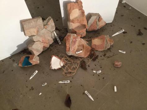
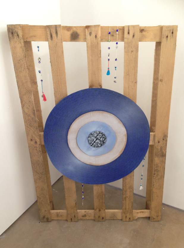
I used trinkets throughout the interior of the tent to give a decorated and lived in refuge shelter feel. I have spent so much time working on, in and around the tent that I have connected with it, making it a familiar place to me now, which I think helped this aesthetic naturally.  The details in the objects that build up this shelter are the most important aspect of my work. From worry beads (rosaries) that I made out of clay with teapot handles and other found objects. Checker pieces, pieces of glass, plaster bullets; hopefully all of these speak for themselves in my work.

IMG_2815IMG_2817

*UPDATED 29th April*

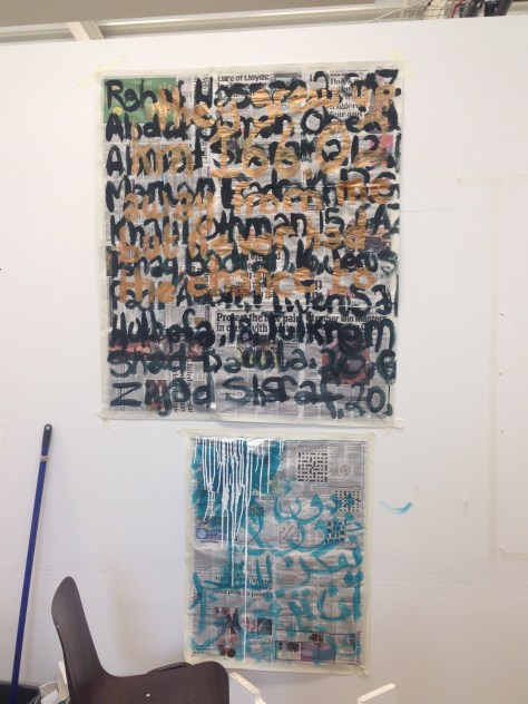
I have added more articles than I could have imagined using a few months ago. I ended up using over 400 screen shot pictures of articles that I had saved over the last couple of years; all printed, cut, collaged and calligraffitied on, as a bigger part of the tent and what covered the majority of the inside of the tent.

While working on the tent fabric which is what made up the walls that I covered on the tent inside, I realised that the semi-meditative or venting state that I would get in to create/paint on my work was all done on the floor. I felt most comfortable listening to specific music after subjecting myself to a while reading/watching articles related to home and the Middle East. My work is deeply personal and allows me to control my emotions and frustrations to do with the subject matter, as this is my reality and I often have to take a moment to myself and get myself together a little more.

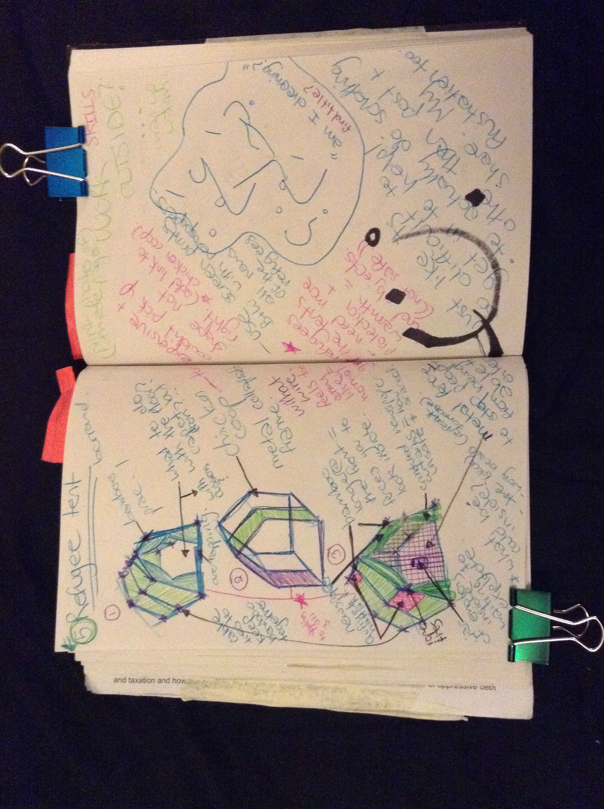
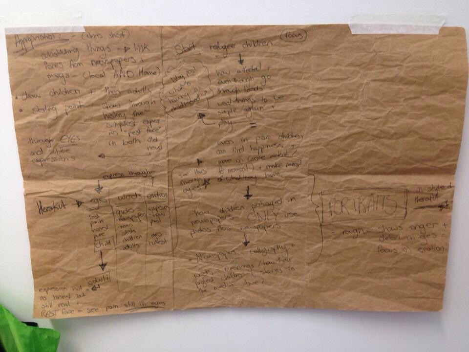
I have found that I have been documenting all of the information I have read about the recent events occurring in the Middle East and all of my ideas for my work and final idea for my degree show installation, through the use of sketchbooks. The photos are of numerous recent pages in my sketchbook that are relevant and an important contributing factor to my work. All of my thoughts, ideas, sketches for designs, emotional rants (a large concept which relates to my work) and notes of significant influences. I struggle to blog sometimes due to a variety of reasons, but keeping a sketchbook is always something I have enjoyed and done naturally throughout any project I work on. It helps me visualise my ideas and concepts, no matter how silly some seem a few days after when I go through the weeks notes; all aspects influence my work and help me keep my mind at ease. After all my work is emotional and extremely personal to me, and my work has become a somewhat reflection of my current ‘everyday life’.


I have inserted a link to one of the voice memos I have recorded about my ideas in general as a mental note. As I have dyslexia, visuals like sketches and voice memos are the best way for me to get my ideas and thoughts down, as writing them tends to fluster me and most times ends up with me forgetting the idea.

https://soundcloud.com/zaperi/voice-memo-uni-3rd-year


The photos below are of my sketchbook. The first photo is of final sketches of the plan for the tent I am planning on building, inspired by refugee tents. My final tent idea is a tent frame made out of bamboo, as I was unable to borrow a tent frame from the scouts/army, and found it to be too expensive to but a collapsable chicken coop off the internet. The bamboo is strong enough (I have experimented and will post pictures soon) to support the paper and bits of fabric (Hatta’ or Qufiyeh fabric relating to Jordan and Palestine) that will be covering the frame. I will calligraffiti all over the tent, during a day I plan on shutting myself off from the world for a while and read and listen to music, hoping to end up with a genuine, honest, emotional response to it all.

I may present my sketchbook in the centre of the tent, along side a jar that will contain trinkets such as a compass, a clock or some worry beads, symbolising my roots; my parents and grandparents, born and raised in the Middle East (Palestine, Egypt, and Jordan), that I always remember with trinkets like these on them at all times throughout my childhood.

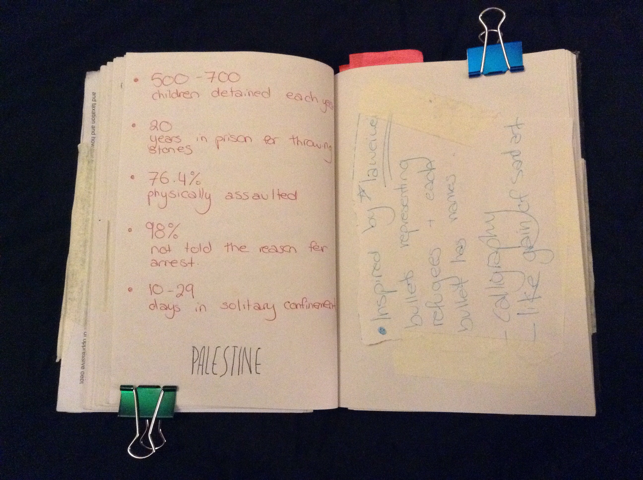
Below are some facts that I have documented about Palestine; that wouldn’t normally be shared often on mainstream media.

The picture below contains one of my first sketches of the concept I had about building the tent.  I was unsure whether to use museum like barriers around the  tent for viewers to walk around; I’m hoping to make viewers feel uncomfortable and slightly overwhelmed by the realness of the issue my work is about, while looking at the “home” hundreds of thousands of people have been living in, ‘looking and not touching’ from the outside; as the world is doing about the occupations and current issues occurring on a global scale.
  

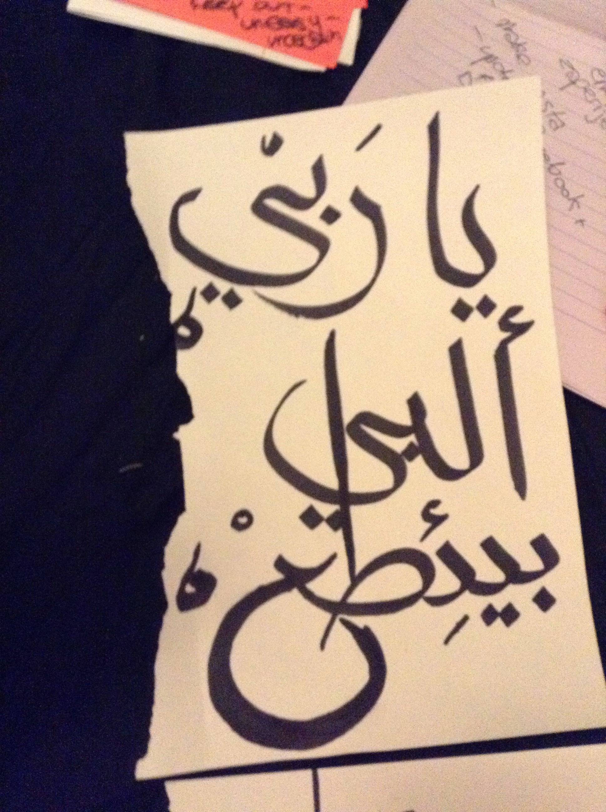
These are a few sketches I did in response to some research while listening to music; the article was about a woman who lives amongst the refugees in a camp and has dedicated her life to around 400 of the refugee children.

The words say ” Ya rabbi, albi byi’taa, byi’taa albi.” which translates to “My God, my heart breaks, it breaks my heart.” I said this under my breath after reading the article. They are common empathetic phrases used often in the Arabic speaking culture.


Advertisement

4) Documentation: – Gap Crit.

These are some images of the work that I made and displayed at my Gap Crit in uni. I hoped to create a post protest-like environment with a variety of pieces I have been working on since I decided to continue working in the subject of current Middle Eastern issues, each piece a different contributing part of my working process.

Using newspaper and paint, I created the piece on the left (as seen below). The names in dark olive green (I later realised could have been related to the known olive trees + Palestine link) of innocent victims that have been murdered in Palestine under the age of 25. That is my generation. The words I wrote on top I feel are self explanitory, ” They grew up 166,02km away from me, but never had the chance to “, which is in fact true.

12714370_10156702252135713_1354263035_n

The piece in the right hand corner is a collage I made with numerous black and white articles I have scanner-collaged (ie. I used a scanner with a variety of compositions of objects I selected like books, trinkets and newspaper articles).

Through using QR codes that I generated that were linked to numerous videos, online articles and petitions, that I’d hoped viewers to watch and be informed of the real issues, that drives my work.

gap crit 2

I hung up the Jordanian Hatta’ (as seen below) with worry (aka prayer beads) as if someone had hung up say, their keys and coat for the day in Western civilisation, but as a reflection of Palestinian civilisation. I did not wish my work to be about a single Middle Eastern culture, however I included references from a variety of them hoping to suggest this. The Jordanian Hatta’, Palestinian and Syrian handmade trinkets that I associate with small sentimental objects people may carry on long journeys or to remember loved ones, and stones varying in shape and size, all scattered symbolising the rock throwers during war and revolution.

12746420_10156702252000713_1952687060_n12746076_10156702251930713_1144411238_n12736087_10156702251955713_1455814976_n12735785_10156702251835713_1079503105_n

The overall feedback I received on my Gap crit was optimistic, and has helped me with the push I needed in my current work. I am passionate, always have been and probably always will be as this is work about my roots; making it quite personal to me.


1) Documentation: Brick collages updated

These are some photos of my original brick collage which I plan on displaying in my final exhibit at our degree show, which was influenced by the work I created for my gap crit at university. I have used a variety of materials in both parts of this work, like broken pieces of brick that I collaged and tried to ‘fix’, evil eyes (handmade by me and ones made in Palestine, Syria and Jordan), glass pieces, a broken piece of teacup, worry beads, stones and fragile plaster bullets that I made with names of the fragile and innocent victims, on them.

Although all the objects act as symbols in themselves; together I hoped they would be able to represent the “rubble” that remained after the chaos, with trinkets and remains of the home and life before it all. I have been enjoying using the objects and trinkets as contributing factors to my work, each with its own voice and input into my work.

Older work:

Newer work:

Personal response; sympathy

IMG_4557.JPG

On the left is a poem that says ‘a storm cannot uproot a forest’; which is how I feel anyone experiencing war may feel, tearing homes apart but not the families. On the right are my thoughts that I painted as I listened to music, and after researching. It says things like ‘oh god, oh poor souls, for the love of god someone protect them’.

IMG_4412.jpg

The bronze and dark green piece I made is a list of names of some of the thousands of names of children that have been murdered in Palestine recently, alongside their age and what city there were from. On top I stated “they grew up km 166.02 away from me, but never had the chance to”. I did not continue my sentence as I felt there were an endless amount of things that these innocent children, would never get the chance to do.

All of these works were inspired by the pieces that I had done as an emotional response to the articles I read mainly on social media. Videos I watched (ones not normally shared on the news) and music I’d listened to about our generation and the troubles we now face (such as “New Americana” by Halsey). Everything around me recently has been influencing and affecting me emotionally; my art is becoming a way for me to process it all.

Printing workshop; collage.

IMG_4544.jpgIMG_4546.jpg

I attended a workshop with second year students on screen-printing, to find the different ways in which I could build up layers and different textures using a variety of different materials, such as drafting film, India ink and paint markers. This was the first test done with a wide paint marker to build up a bold opaque text. I simply wrote my name in Arabic. I then played with different dark cards and cutouts to block out and create a positive and negative space. I did this so I could have the freedom to play around with the composition of my printed collage.

IMG_4551.JPGIMG_4554.jpg

I felt inspired to get more into collaging by layering the prints, as well as collaging 3D objects into my pieces. Using different coloured paints and inks, different papers as well as anything that enables me to build up layers such as tracing paper. The bottom right photo is my outcome from the workshop, which has a background, done using different pressures on the squeegee while printing. The text on top that has been printed is what I transferred onto the screen and then over the dry background. I will be trying this more in the future in order to have multiple and unique card to collage with.


Summative Post: Documentation

Artist statement:

I started off this project a brief idea of the concepts I wanted to work around, but no idea where to start. I started with the idea of the refugees suffering in the camps in Jordan (Jordan being home for me) and the effects that the trauma and chaos of war has had on them.

The Zaatari refugee camp in the North of Jordan was the camp I decided to focus on. For my subject work I started looking at different ways I could portray emotions and the truths of the war and its effects, looking at artists such as Herakut and Joel Bergner and the positive impact they made on the Zaatari community through their work. I wanted to create work with similar intentions on a smaller scale with subtle messages; making others more aware of the pain and emotions related to being a refugee. I wanted to show that even in darker times, no matter how hard things became, they were still able to remain optimistic and their resilience enabled them to make the most of their new environment.

I have experimented with different mediums and techniques to try and best express these feelings. For example; painting and collaging using newspaper articles about the refugees or similar issues, printing different forms of text and calligraphy, in addition to using symbolic images of Middle Eastern good fortune.

Despite being held back by a period of illness, I feel successful and proud with the outcomes of my work.

1) Children and the worst affected:

I started off by researching the refugees and the ones that were most affected which I found to be the children. I had originally wanted to focus on the children that were affected and to possibly work on portraits of them; showing the pain and distress that they had suffered but also that they remained positive and optimistic. However I then realised that this would be difficult for me to do due to ethics and consent (of the pictures I had planned to take of the children to use as first hand references). This however lead me to using newspaper pictures to paint the portraits (where the children that had been photographed had already had consent from parents for the photo to be used). I also then decided to focus on the idea that made me focus on the refugee children in the first place; that they remained positive even through chaos and remained resilient and strong. This could be said for refugees, adults and children alike, in general; and so I began to use positive but strong messages in my work from this concept.

IMG_1381

https://zperidakis.wordpress.com/2014/12/19/research-narrowing-down/

2) Colour Theory (field project):

This project influenced and helped me develop my work throughout the whole year, so much more than I had originally anticipated. After all the workshops, I started to experiment more and more with colour and began to use it to change the emotional aesthetic in my work. Using complimentary colours and more rich tones (whereas previously I was sticking to the safe option of more dull and dark tones) has enabled me to create pieces that have a more positive feel and this has allowed me to use text to focus on the serious aspect/message I have been trying to convey in my work.

IMG_1351

https://zperidakis.wordpress.com/2015/01/05/color-theory-linked-to-subject-work/

3) Cut out paintings:

I attended a few workshops where we worked on cut out shapes of wood (instead of square canvas which I was used to before), and found them to be something that I used throughout the rest of my project. I made my self familiar with the machinery in the wood workshop and after collecting numerous ‘found’ pieces of wood (this relates to my research in contextualisation about the artist Tayseer Barakat, who creates pieces on found objects) and I began to cut the pieces ready to work on. I found that the outcomes using the method of cut out paintings to be more visually interesting and allowed me to add a new dimension to my work.

IMG_3030_2

https://zperidakis.wordpress.com/2015/01/28/cut-out-paintings-color-theory-related-to-subject-and-field-work/

https://zperidakis.wordpress.com/2015/03/05/cut-out-paintings/

4) Collaging and using mixed media/ found objects:

I started to work with found objects, and used the influences of the collaging field project I was apart of throughout the rest of my work. The project was so helpful and inspired me to start working and layering my work which enabled me to incorporate newspaper articles (from newspapers both back home in Jordan and here in the UK) about the refugees. I also began experimenting more with texture and layering text and symbols of good luck/good fortune through the use of linocut prints, spray painting and stencils and even using glue guns and hot glue to create raised text. This influenced the rest of my work throughout the year and with influence of the colour theory workshops as well; took my work to a new, brighter and more interesting level.

IMG_1521

https://zperidakis.wordpress.com/2015/02/10/field-project-gorillas-in-the-roses-collaging/

https://zperidakis.wordpress.com/2015/03/15/personal-response-to-artist-research-%EF%BB%BFedit%EF%BB%BF%EF%BB%BF%EF%BB%BF%EF%BB%BF%EF%BB%BF%EF%BB%BF/

https://zperidakis.wordpress.com/2015/01/15/stencil-and-calligraphy-experiments/

https://zperidakis.wordpress.com/2015/02/20/lino-cutsprints-work-in-progress/

5) Final pieces being displayed

I have explained in detail the final outcome of each piece. I chose to display them in collections of collages to emphasise the feeling of them becoming ‘decorative’ pieces and for them to be used as symbols or reminders of hope for the refugees or those suffering in the Middle Eastern wars and chaos.

IMG_3026_2

 https://zperidakis.wordpress.com/2015/06/09/final-pieces-and-development/

Personal response to artist research Edit

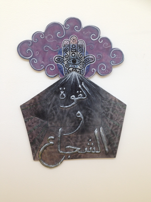
I have been experimenting with different textures, colours and materials (such as hot glue, acrylic paint, ink pen and spray paints) to create brightly coloured smaller pieces from found pieces of randomly shaped wood. I have kept the original cuts, carvings and dents in the pieces and worked around the ‘flaws’ to beautify them. Each piece has a message written in Arabic related to refugees or the idea of pain and chaos. 
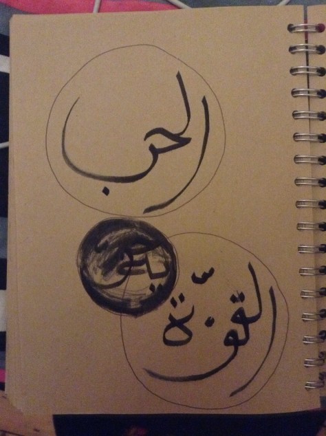
This one for example says “Quwwah” in Arabic, which means strength, which I wrote using a glue gun and hot glue to give it a 3D effect when I spray painted over it. I am so pleased with the way these pieces turned out. All of them simple and small with big bold colours and meanings. 
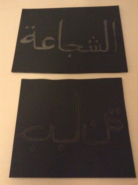
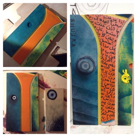
“Shuja’a” means strength in arabic. I like the idea of using English letters to write an Arabic words phonetics so that non-Arabic speakers can still read the message without instantly knowing what the piece is about.  
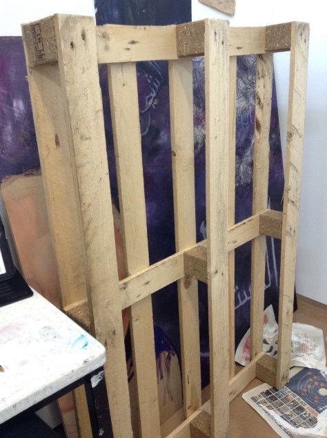
I plan on working on this crate using some symbols of good fortune/ good luck, to turn this item of ‘junk’ into somewhat of a lucky charm.

Cut out paintings 

These are pictures of the progress so far for the cut out painting I designed for our new field module. I decided to link this to my subject area as well as I though it could move my work into a less serious place, but still subtly conveying a message. The piece is inspired by the tents in the refugee camps and the evil eye/all seeing eye (which is believed to be a lucky charm that looks out for you in the Muslim and most of the middle eastern area) is looking down on the tent and acting as a halo. A confusing piece with surrealist hints but I am excited to see where this piece goes. 


Calligraphy practice:


I recently purchased a few art supplies to get me back into the swing of things after being away for so long. I bought a bamboo drawing ‘pen’ which is used with inks to practice calligraphy. I have been playing around and practicing with it a lot to get the hang of it as it is not that easy. 

These are some random words and phrases however the calligraphy itself is some of the best I’ve managed to do in a while. The picture with the calligraphy in the bubbles is more thought through and are words saying war and strength. I am planning on using this more and more in my work now creating good angles in the calligraphy also an authentic Arabic feel to my work by using ink and old fashioned drawing utensils. 


Lino cuts/prints – work in progress:


I used Lino to create cuts to print from. I decided to create two cuts that would be printed on top of one another, the words read “bravery” and the contradicting term “cowardliness” which will be printed on top of each other however will also mirror each other as one was carved backwards and will there for be printed mirrored. 


This last piece I am planning on carving the hand of Fatima symbol on with the words written in creative calligraphy “strength and bravery” as part of this bravery themed collection of print. All the pieces at linked to lucky objects and I plan on making more to go with this series as I am really enjoying getting back into things and into printing.