All posts by zperidakis

Final pieces and documentation development:

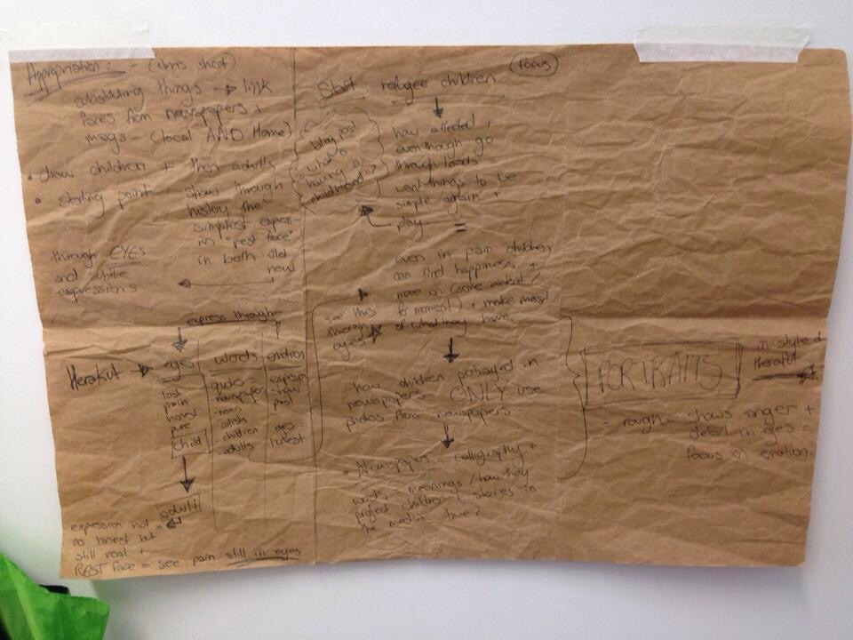
I wanted each final piece to be able to give a subtle message and be semi-self explanatory. Although some have text in arabic, I wanted the overall compositions to have clues as to what the piece is about or what it’s suggesting. Through the use of the symbols like the Evil Eye and the Hand of Fatima, I hope to suggest that the found objects have now turned into items of good luck, hope and optimism. Items that the refugees cling on to for hope and decorate their new fabric houses, in hopes to make it feel more like a home.

IMG_3020_2

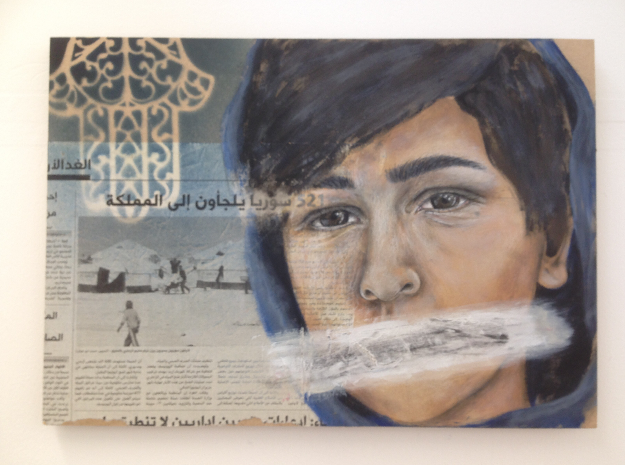
This is a piece (above) that I had started at the beginning of the project and finished recently at the end of my research. I wanted to come back to this piece and create an almost full circle; tying in the new methods and techniques of working that I had learnt or created through out the year after starting it. The portrait in the piece is of a young Syrian refugee boy who’s photograph had captured my attention in my early research for this project. He stood in a crowd and seemed to have a very honest and innocent expression on his face which made him seem still; while the world around him seemed busy. It made me think about the child’s future and the uncertainty of where he would be in a few years time?, who would be around him?, how much longer is this going to go in for? will all of his family still be around him?, would he even be able to go home after the chaos has ended? I wrote some words related to these questions in Arabic, in the background of the piece. Through the use of darker colours like deep purples and greys, and collaged newspaper articles about the chaos in Syria, I tried to recreate a busy and negative feeling background to mirror the boys surroundings at the time. I used purples and blue, in contrast to the boys orange-y skin tones to compliment each other. The word “Al Mustaqbal” is written boldly at the bottom of the piece which means “the future” suggesting that the boys future is uncertain from now on. Due to the writing being a main focal point in the piece I wanted to write it in Arabic as to not make the meaning too obvious. When I went back to working on this piece I then added patterns of the symbols I had been using like the evil eye and the hand of Fatima spray painted lightly using a stencil to create a geometric pattern in the corners. This was done to symbolise the hope that I felt was needed for the boy, in order for him to have a chaos free future.

I had originally encountered a problem while trying to figure out a way to hang this piece. I hadn’t anticipated that that the weight of the piece would be such an issue; and when time came to hang it up on the wall space that I was given, I was stuck. Due to the painting being done on a large piece of MDF board, it is extremely heavy, therefor in order to be able to hang it up I had to glue on some wooden brackets and use nails and screws to reinforce them. However when I tried to screw holes in the wall I found that the wall was actually hollow in the middle and therefor they wouldn’t be able to hold the weight of the painting. However I was able to divert the problem and stood the piece on a wooden block, and placed one of the hands of Fatima I made in front of it. This worked out well as it hints to the idea of palm reading (a large belief in the Middle Eastern culture) and relates to the idea of an uncertain future.

IMG_3023_2

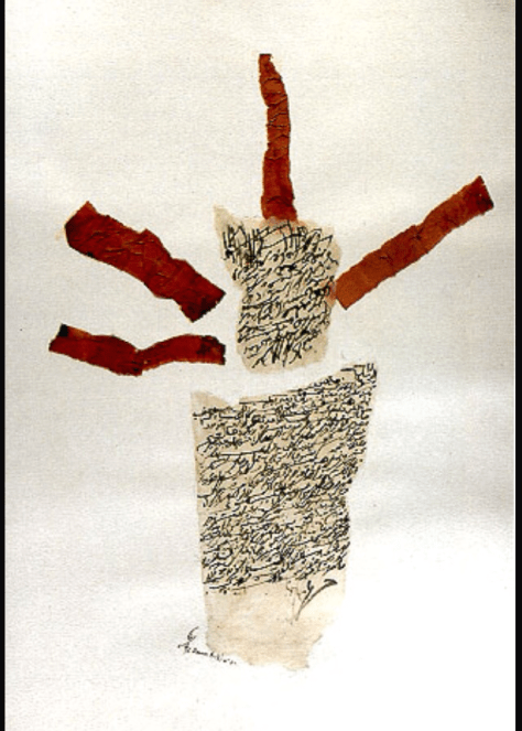
This collage of smaller pieces are all done on found pieces of wood that I manipulated slightly and cut up (which relates back my research of the artist Tayseer Barakat) and are created using a mixture of collage, acrylic paints, coloured pencils, spray paints and stencils, ink stamps, tracing paper and hot glue gun glue. The girl in the portrait is a young refugee girl who lost her sight in one eye from shrapnel in a bomb in Syria. The text on the left is a newspaper transfer that translates to “Haqii Ashki” which means “I have a right to complain”. All the pieces were created with the theme of the media corrupting and distorting the truth in the news about the refugees. The piece with the larger evil eye and text over it is arabic and translates to “we are strong, we will remain strong, even after the chaos.”

IMG_3024_2

This piece is done on an opened up box which links again to my artist research of working on “junk” or found objects. I wanted to create a piece that on its own was powerful and has the aesthetic of a house decoration.

IMG_3025_2

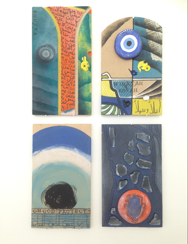
These are a few pieces that I created using mixed media and collaging methods (clay, hot glue, found beach glass, dried paint, exc.) to create another collective collage using bright and vibrant colours. However all with sayings or ‘thoughts’ related to refugees and war. [Top left: “shujaa” means bravery. Top right: “Himayah w Quwah” means protection and strength. Bottom left: is a prayer for protection.] The colours used throughout these pieces were influenced by my field project Understanding Colour, and compliment each other and hopefully give a positive feel; so the pieces can be used as decorations to bring hope or as a reminder to stay optimistic.

IMG_3026_2

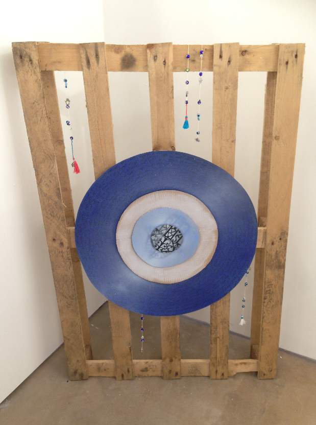
This piece was done on a crate that I found and distressed. I made the hanging ‘worry beads’ with tassels and charms using a variety of mix-matched beads. The evil eye in the middle has text all around it which I wrote about my thoughts on all of the refugees and the approach the media has taken to cover their stories. It is done on pieces of different types of card and is done in acrylic paint and spray paint. My aim for the overall piece is for it to seem like it would have been used for a large symbol of luck possibly in the refugee camps.

IMG_3027

I created this portrait using acrylic paints and coloured pencils, over a newspaper article in arabic about the Syrian refugee children in the Jordanian camps. The hand of Fatima sprayed on in the corner and the overall appearance is meant to show that the girl in the piece symbolises pain and ‘not having a say’ in the situation, also suggesting that the media in the west and the Middle East are different and the truth about the situation is not being told honestly.

IMG_3028_2

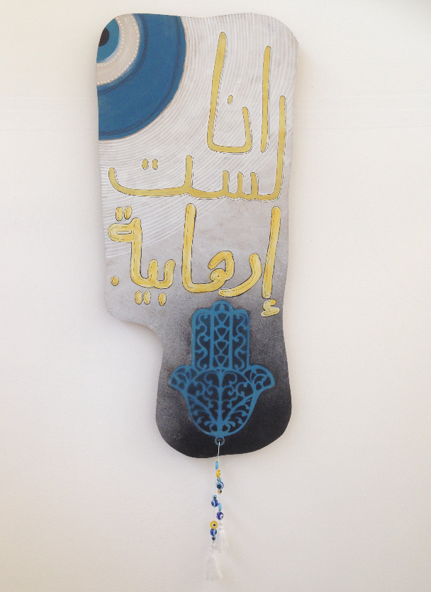
This piece at first glance is meant to look like a painting or decoration that would be hung up in a home, and is done with bright acrylic colours to symbolise a positive feeling. However the text translates to the quote from a news story that I had seen about a 5 year old Palestinian boy in occupied Palestinian land, who had shouted the words “Ana lasto irhabiyah” which means simply, “I am not a terrorist”. The boy was nearly arrested in Palestine for suspicious behaviour while playing outside and was accused of being a terrorist. This is what inspired this piece, as I wanted to show what stories Western media avoids covering.

IMG_3029_2

These are some of the Lino-cut print experiments that I produced on tracing paper. I used this method because it never gives the same two results and has a rough and newspaper print feel to it. I felt like these pieces were powerful on their own as the words translate to “Al shuja’a” which means “strength” and “Al jaben” which means “a coward”. Words commonly used by the media and in newspapers related to stories about the refugees.

IMG_3030_2

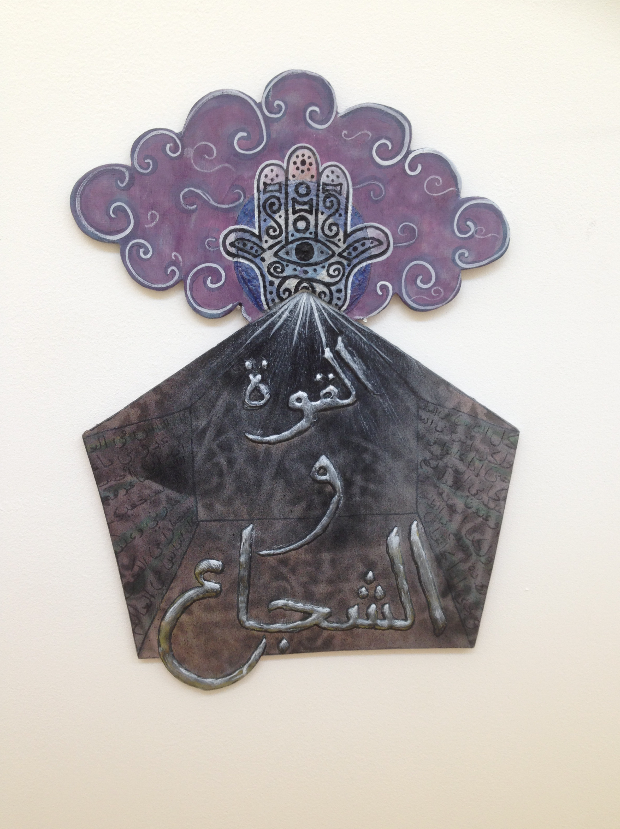
This is the piece that I did in one of the workshops I attended about cut out paintings (which influenced most of my other pieces). It is meant to symbolise a refugee tent and the cloud on top symbolises the burden of being a refugee. The hand of Fatima and the evil eye in the middle are meant to be reminders of hope ‘look down on’ the refugees protecting them. The words translates again to “Al quwah w al shujaa” which mean strength and bravery, two of the traits needed for the resilient refugees to survive. The colours I used emphasise the burden of becoming a refugee and the pain related to it.

IMG_3031

These are my two sketchbooks that I worked in throughout the two fields projects this year; the black one is related to the “Gorrillas in the roses” project, and the brown one is related to the “Understanding colour” project. I chose to display them on a small table covered in a traditional Middle Eastern head scarf (which is not worn for religious beliefs but more as a symbol of pride from the country it represents). I have put two clay ‘decorations’ or symbols of luck that I have made on top, to turn the display into an installation piece on its own.

Summative Post: Documentation

Artist statement:

I started off this project a brief idea of the concepts I wanted to work around, but no idea where to start. I started with the idea of the refugees suffering in the camps in Jordan (Jordan being home for me) and the effects that the trauma and chaos of war has had on them.

The Zaatari refugee camp in the North of Jordan was the camp I decided to focus on. For my subject work I started looking at different ways I could portray emotions and the truths of the war and its effects, looking at artists such as Herakut and Joel Bergner and the positive impact they made on the Zaatari community through their work. I wanted to create work with similar intentions on a smaller scale with subtle messages; making others more aware of the pain and emotions related to being a refugee. I wanted to show that even in darker times, no matter how hard things became, they were still able to remain optimistic and their resilience enabled them to make the most of their new environment.

I have experimented with different mediums and techniques to try and best express these feelings. For example; painting and collaging using newspaper articles about the refugees or similar issues, printing different forms of text and calligraphy, in addition to using symbolic images of Middle Eastern good fortune.

Despite being held back by a period of illness, I feel successful and proud with the outcomes of my work.

1) Children and the worst affected:

I started off by researching the refugees and the ones that were most affected which I found to be the children. I had originally wanted to focus on the children that were affected and to possibly work on portraits of them; showing the pain and distress that they had suffered but also that they remained positive and optimistic. However I then realised that this would be difficult for me to do due to ethics and consent (of the pictures I had planned to take of the children to use as first hand references). This however lead me to using newspaper pictures to paint the portraits (where the children that had been photographed had already had consent from parents for the photo to be used). I also then decided to focus on the idea that made me focus on the refugee children in the first place; that they remained positive even through chaos and remained resilient and strong. This could be said for refugees, adults and children alike, in general; and so I began to use positive but strong messages in my work from this concept.

IMG_1381

https://zperidakis.wordpress.com/2014/12/19/research-narrowing-down/

2) Colour Theory (field project):

This project influenced and helped me develop my work throughout the whole year, so much more than I had originally anticipated. After all the workshops, I started to experiment more and more with colour and began to use it to change the emotional aesthetic in my work. Using complimentary colours and more rich tones (whereas previously I was sticking to the safe option of more dull and dark tones) has enabled me to create pieces that have a more positive feel and this has allowed me to use text to focus on the serious aspect/message I have been trying to convey in my work.

IMG_1351

https://zperidakis.wordpress.com/2015/01/05/color-theory-linked-to-subject-work/

3) Cut out paintings:

I attended a few workshops where we worked on cut out shapes of wood (instead of square canvas which I was used to before), and found them to be something that I used throughout the rest of my project. I made my self familiar with the machinery in the wood workshop and after collecting numerous ‘found’ pieces of wood (this relates to my research in contextualisation about the artist Tayseer Barakat, who creates pieces on found objects) and I began to cut the pieces ready to work on. I found that the outcomes using the method of cut out paintings to be more visually interesting and allowed me to add a new dimension to my work.

IMG_3030_2

https://zperidakis.wordpress.com/2015/01/28/cut-out-paintings-color-theory-related-to-subject-and-field-work/

https://zperidakis.wordpress.com/2015/03/05/cut-out-paintings/

4) Collaging and using mixed media/ found objects:

I started to work with found objects, and used the influences of the collaging field project I was apart of throughout the rest of my work. The project was so helpful and inspired me to start working and layering my work which enabled me to incorporate newspaper articles (from newspapers both back home in Jordan and here in the UK) about the refugees. I also began experimenting more with texture and layering text and symbols of good luck/good fortune through the use of linocut prints, spray painting and stencils and even using glue guns and hot glue to create raised text. This influenced the rest of my work throughout the year and with influence of the colour theory workshops as well; took my work to a new, brighter and more interesting level.

IMG_1521

https://zperidakis.wordpress.com/2015/02/10/field-project-gorillas-in-the-roses-collaging/

https://zperidakis.wordpress.com/2015/03/15/personal-response-to-artist-research-%EF%BB%BFedit%EF%BB%BF%EF%BB%BF%EF%BB%BF%EF%BB%BF%EF%BB%BF%EF%BB%BF/

https://zperidakis.wordpress.com/2015/01/15/stencil-and-calligraphy-experiments/

https://zperidakis.wordpress.com/2015/02/20/lino-cutsprints-work-in-progress/

5) Final pieces being displayed

I have explained in detail the final outcome of each piece. I chose to display them in collections of collages to emphasise the feeling of them becoming ‘decorative’ pieces and for them to be used as symbols or reminders of hope for the refugees or those suffering in the Middle Eastern wars and chaos.

IMG_3026_2

 https://zperidakis.wordpress.com/2015/06/09/final-pieces-and-development/

Summative Post: Contextualisation

1) Herakut: A starting point

Herakut have been the main starting point for my work based on refugees, as they work similarly; in refugee camps, creating bright and beautiful murals with an important message related to the camps and the struggles associated with war and the amount of resilience it requires to be a refugee. I wanted to try to create works that did the same thing; be aesthetically appealing with a strong yet non-obvious message in each. This was the common theme throughout all of my work and I used text (in both Arabic and English letters so some things can be read and others cannot) and arabic calligraphy to portray this.

IMG_1386

https://zperidakis.wordpress.com/2014/11/10/herakut-the-artists-behind-the-zaatari-art/

2) Live stream: Gaza

This was part of my research for what life was actually like for people who lived in Gaza or similarly occupied places that now live in refugee camps. I had been researching and trying to find honest news and forms of media (which was an issue I had been looking into; seeing how the media in different countries portrays the honest truth and how much the media actually shares with the Western world.) This was a live stream that I found from a journalist who was living in Gaza and had been live streaming footage to followers through an online website, for those who wanted to see what life was actually like during the constant bombing in everyday Gaza life. Although it was distressing to watch, it gave me a whole other insight to what was actually going on in a chaotic world that was so close to home for me. The idea that so much was being hidden in Western media upset and angered me. People were not getting the honest truth and it was easy for me to see why the connection of the Middle-Eastern culture and the term “terror” were so often associated together, even innocent children. It became a sort of mission of mine to incorporate honest influences into my work to support the powerful messages I was trying to convey, but also portray the more serious and painful effects of it all.

IMG_1385

https://zperidakis.wordpress.com/2014/11/17/live-gaza/

3) Tayseer Barakat: Found objects

Through my research of Palestinian refugee artist Barakat, I found that his work used things that would normally be categorised as ugly or useless, and worked on them to turn them into works of art in their own right. As he grew up as a refugee himself, supplies for making art were limited and therefore his resilience and capability to use these found objects inspired me to use similar ground to work on. I used found pieces of wood and card throughout my work and tried to accomplish the same concept; turning ‘junk’ into art, working with new interesting textures and surfaces that I was not used to working on normally. I felt like this gave my work more character and added another and deeper meaning to my work, as even the ‘canvases’ I was working on, became part of my artworks.

IMG_1535-0

https://zperidakis.wordpress.com/2015/01/20/artist-research-tayseer-barakat/

4) Mental Note: the media

I had been constantly watching and reading the different news stations that discussed the Middle East, and the problems that had been going on in the area. From stations and news agencies in Jordan online and here in the UK, and seeing the differences in the way the news was being portrayed even about the same subject truly shocked me. Although the stories were being shared; they were far from the truth in many cases. I documented this a few times so that I could reference this in my work and to support my concepts that the media is never fully honest. This is an example of one that I recorded. I used this concept and also the irony throughout my work, which I was going to incorporate as text or genuine newspaper cut outs to show the comparison of the two.

https://zperidakis.wordpress.com/2014/12/30/quick-mental-note/

5) Rana Bishara: symbols of hope

I was fascinated by Bisharas work and the way she uses Middle-Eastern symbolic objects throughout her work. She takes these symbols of hope, luck or respect and incorporates them into her work beautifully creating a curiosity amongst her viewers about the truth or symbolism of the object. Cacti specifically, became a common symbol used throughout her work representing the ‘Nakba’ (which translates to catastrophe) which is about the Palestinian occupation; when more than 700,000 Palestinians were forced out of their homes and their land in 1948. I decided to use a similar trend throughout my work of using specific symbols of hope and good fortune (in my case the Evil Eye; a symbol that wears of bad luck, and the Hand of Fatima; which brings good fortune to whomever carries or wears one). I started to use these symbols in all of my work, and similarly began incorporating colours such as golds and deep blues into my work, which are strongly associated with these symbols and the ideas of luck and fortune.

IMG_1513

https://zperidakis.wordpress.com/2015/03/14/artist-research-rana-bishara/

Artist statement (updated):

I started off this project a brief idea of the concepts I wanted to work around, but no idea where to start. I started with the idea of the refugees suffering in the camps in Jordan (Jordan being home for me) and the effects that the trauma and chaos of war has had on them.

The Zaatari refugee camp in the North of Jordan was the camp I decided to focus on. For my subject work I started looking at different ways I could portray emotions and the truths of the war and its effects, looking at artists such as Herakut and Joel Bergner and the positive impact they made on the Zaatari community through their work. I wanted to create work with similar intentions on a smaller scale with subtle messages; making others more aware of the pain and emotions related to being a refugee. I wanted to show that even in darker times, no matter how hard things became, they were still able to remain optimistic and their resilience enabled them to make the most of their new environment.

I have experimented with different mediums and techniques to try and best express these feelings. For example; painting and collaging using newspaper articles about the refugees or similar issues, printing different forms of text and calligraphy, in addition to using symbolic images of Middle Eastern good fortune.

Despite being held back by a period of illness, I feel successful and proud with the outcomes of my work.

Field projects overall reflection

After working on both field projects, I realised how much they had actually influenced my work for the better. Although both were extremely different to one another, they have both played a massive part in helping me to expand and explore new areas which have benefited me in my practical Subject work.

The colour theory field project helped me to establish a better understanding of colour and the ways in which using the right shades and contrasts can strengthen and add more depth to my work. Through the use of complimentary colours and bolder more vibrant colours, I have built up a whole new body of work that has exited me as I experiment and try new combinations, with the influences of what I have learnt in the other field project; Gorillas in the roses. The second field project dealt with collaging and overlapping textures and colours to create the final outcome using a variety of different materials such as paper cut outs and card. In my subject work I have incorporated things I have learnt from both projects and have used newspaper cut outs and different random shaped pieces of card to build up layers, adding more depth and a whole new dimension to my work. This enables me to suggest subtle hints in my work, of the news articles (in the newspapers) by transferring some onto wood and glueing/sticking some down, this is something which I would not have been able to do previously without finding a way to collaging it into the work instead of literally painting it in. This was something I had been struggling with previously as I did not want to add literal or obvious clues into what my work was about. However through the use of collaging and layering I have been able to achieve this. The array of colours I have been using in the work (where previously I had only used dark and dull colours to add a feeling of chaos) have also grown, using colours to evoke certain feelings like golds, yellows and oranges to show riches and positivity in contrast to dark blues which not only compliment each other but also shows a darker more sad feeling to the work. This simple method of using the contrasting colours helps me tremendously to show that even in darker more chaotic times, you can find a positive side. The combination of painting using these colours over newspaper, for example, suggests these feelings are related to the article and makes the viewer curious of the actual meaning of the piece.

Overall both projects have been extremely influential to me and have helped me experiment more and add more depth in my work, where I had previously felt slightly stuck and uninspired. Although they did not directly relate to my practical work in some ways to my subject work, I took brand new aspects from both and enjoyed both thoroughly.

Dissertation PDP – Arabic Calligraphy

From the moment we left the first dissertation lecture to this very day, I get nervous at any mention of it. Not because it’s a long and detailed essay that requires hours of research and thought (well of course that makes me a little nervous); but mainly because I want to be able to express myself about a subject I have become growingly more and more passionate about over the course of the last few months, in the best way I possibly can and to give such a beautiful and well respected art form, the credit it deserves.

Calligraphy is something that I began to experiment with and incorporate into my subject and field work in a playful manner and I had previously never really known the level of skill and amount of time and dedication that it required. My work in our subject and field projects have always been based on my roots growing up in the Middle East and the way it has influenced and inspired me so far. The culture, the beliefs, the landscapes, the traditions, the people; all shaped who I am today and continue to drive me to research and learn more about it all and to be able to share it with those around me in my new environment here. While working on some pieces in the last few months that were about the refugees from Syria that had moved to the refugee camps in Jordan (which is home for me) and how their lives had changed so drastically for worse; but still remained strong and optimistic. This is something that has inspired me to appreciate everything and everyone I have an in my life and I wanted to be able to create work that made people feel the same way when they view my art. I wanted to use subtle messages and symbols that evoked a certain feeling of curiosity about what the subject matter of my pieces was about. I experimented with textures; which resembled the desert ground and used colours that were bright and vibrant to capture peoples attention and create an optimistic vibe, but needed to find a way to effectively portray my important and powerful message across. I began to experiment with text and typography and then started to incorporate traditional arabic calligraphy and more intricate styles of text in my work. The more I played around with text and the harder I found it, the more interested I became in the methodology and technique they required. However when I first started to think about my dissertation I hadn’t really thought about connecting the two and just looked forward to working on my level of calligraphic skill to improve it in my practical work. I began reasserting the history of art in the middle east and the many different ways it has evolved; from ancient egyptian hieroglyphics to modern and contemporary art today. I was excited about the hundreds of different art forms that were popular in the Middle East but began to panic a bit as I was unsure what to focus on in such a broad area of research. At first the history and influences of the evolution of art in the Middle East as a whole was what I was considering looking into in depth, however after a meeting and discussion with my dissertation tutor; it clicked. Calligraphy; arabic calligraphy specifically and the many ways it has evolved and changed over time was definitely the way to go. I began to research into the origins of calligraphy and the arabic language and found out that there are more than one theories of where and who started or created it and remain fascinated by them. Also how they have evolved and spread from country to country and the many ways they have changed and evolved because of these influences. I have become so interested in the history of it all and in my own time (despite having studied some of the history in school and was uninterested and unengaged by it) have become captivated by it all and constantly research and explore the world of arabic calligraphy.

I’m unsure of where I will end up exactly with my research and how far it it will take me with my practical work as well, but I’m looking forward to the process and to learn more about this skill itself and its many variations in depth. Although I’m still a little anxious about the writing of the essay itself, I plan to do my best and try to explore and portray the world of Arabic calligraphy and its history to the best of my capabilities. So, here’s to the next few months and hopefully the beginning of the next turning point in my art work.

Personal response to artist research Edit

I have been experimenting with different textures, colours and materials (such as hot glue, acrylic paint, ink pen and spray paints) to create brightly coloured smaller pieces from found pieces of randomly shaped wood. I have kept the original cuts, carvings and dents in the pieces and worked around the ‘flaws’ to beautify them. Each piece has a message written in Arabic related to refugees or the idea of pain and chaos. This one for example says “Quwwah” in Arabic, which means strength, which I wrote using a glue gun and hot glue to give it a 3D effect when I spray painted over it. I am so pleased with the way these pieces turned out. All of them simple and small with big bold colours and meanings. 
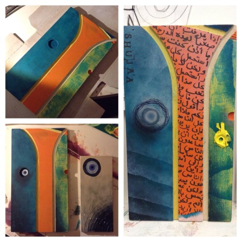
“Shuja’a” means strength in arabic. I like the idea of using English letters to write an Arabic words phonetics so that non-Arabic speakers can still read the message without instantly knowing what the piece is about.  
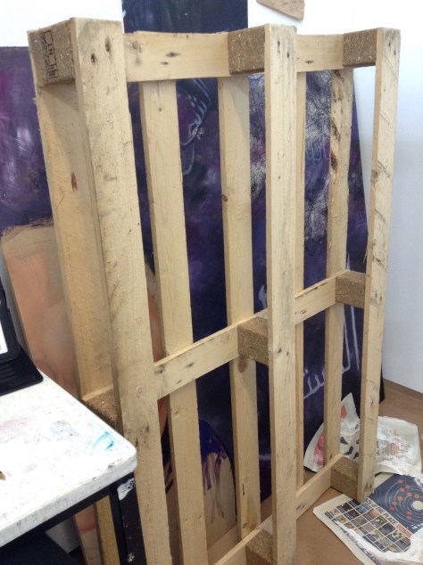
I plan on working on this crate using some symbols of good fortune/ good luck, to turn this item of ‘junk’ into somewhat of a lucky charm.

Artist research: Rana Bishara

Rana Bishara is a Lebanese born artist who work is mainly based around social and political issues linked to conflict. 


The reason Bishara uses cacti a lot throughout her work is because it has become a symbol of the “Nakbe” which is the name of the time of conflict and tragedy in 1948 in Palestine. The reason for this is that the cacti is resilient with little resources, it can protect its self against danger and can survive even after being uprooted. It was also used as fences to keep enemies off unwanted territory. The cacti is a strong symbol for the Palestinian refugees. 


Her use of calligraphy and typography in some of her work helps support the narrative but also gives the viewer better insight into the message being portrayed. Although the text is not easy to read (which is similar to my own work; as I use it to symbolize thoughts in someone’s head who is angry or struggling like a refugee) some words and phrases are legible and give the viewer an insight into her emotions and thoughts going through the artists mind at the time. 


Her distinct work using Cacti and calligraphy often portrays a message that may not be u sera told straight away at first but when the knowledge of the subject is known; becomes perfectly clear. This is something I wish to add and incorporate into my work more by adding symbols and words that may not at first be understood; however with an explanation becomes clear. 

I have been trying to find a way to make a subtle yet strong impact in my work however have found this difficult. Through the use of calligraphy, Arabic text and clipping from news articles I have tried to achieve this however found that it was sometimes unclear to those who don’t understand the language. I may start to add a caption or title for every piece, in English as to give the viewer a clearer idea of the narrative of the piece but to not give away too much and get the viewer thinking. 

Artist statement:

I started off this project knowing briefly what ideas and concepts I wanted to work around, but no idea where to start. I decided to start off around the idea of the refugees suffering in the camps and the effects the trauma and chaos of war had on them. 

The Zaatari refugee camp in the North of Jordan (Jordan being home for me) was the camp I decide to focus on. For my subject work I started looking at different ways I could portray emotions and the truths of the war and its effects, looking at artists like Herakut and Joel Bergner (aka JoeArtista) and the murals they created in camps and the great impact they made on Zaatari community. I decided to work similarly creating pieces that had an impact on a smaller scale with subtle messages; making others more aware of the pain and emotions related to being a refugee; specifically the children affected. 

I have experimented with so many different mediums and techniques to try and best express these feelings from using collaging skills learnt in field and printing calligraphy/stenciling to painting using oils and using inks for writing traditional calligraphy. Although I was set back a bit due to illness and being on bed-rest, I am still motivated to continue to work on this project and to expand and explore the area further to create more work with good impacts and messages. 

Cut out paintings 

These are pictures of the progress so far for the cut out painting I designed for our new field module. I decided to link this to my subject area as well as I though it could move my work into a less serious place, but still subtly conveying a message. The piece is inspired by the tents in the refugee camps and the evil eye/all seeing eye (which is believed to be a lucky charm that looks out for you in the Muslim and most of the middle eastern area) is looking down on the tent and acting as a halo. A confusing piece with surrealist hints but I am excited to see where this piece goes.